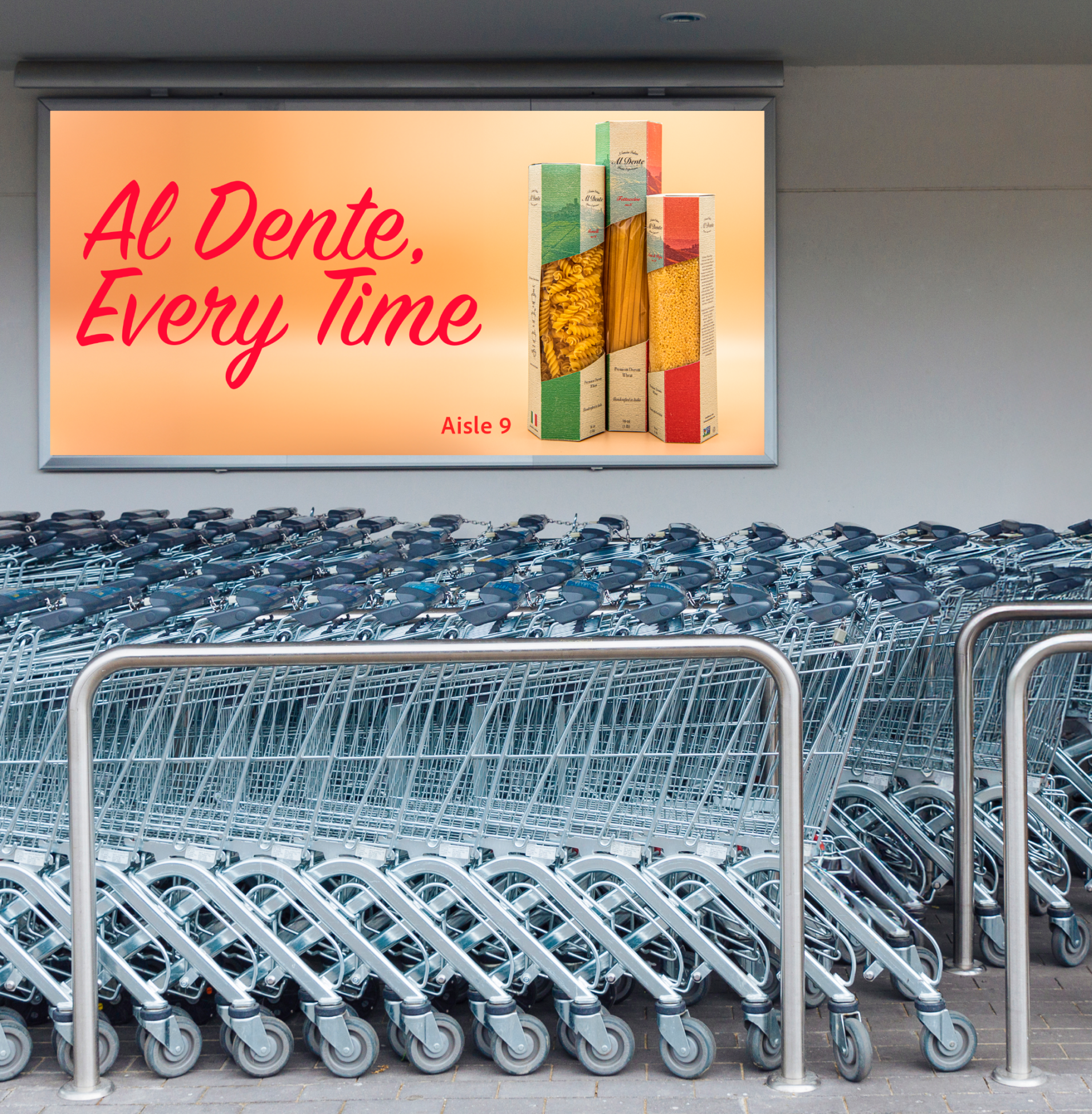
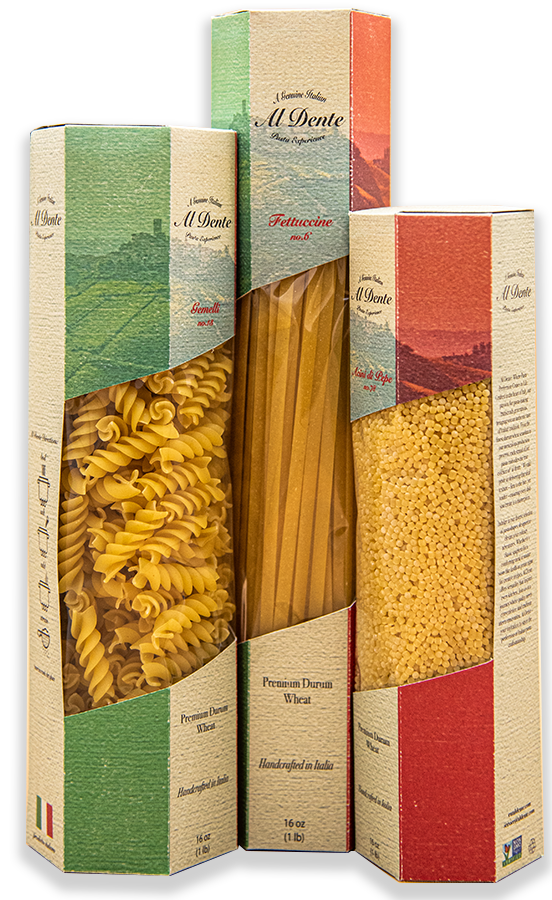
Al Dente Pasta
Design Process | Physical Prototyping | Craft
While grocery shopping, some items feel unconscious to grab. Shoppers are likely to grab the same brand of an item that they have for years, but what if there was a new brand looking to make a splash on the shelves?
Understand
Creating a package from the ground up was something that was completely new to me. To get a better understanding of how pasta packaging is usually managed, I conducted research both in local stores and online.
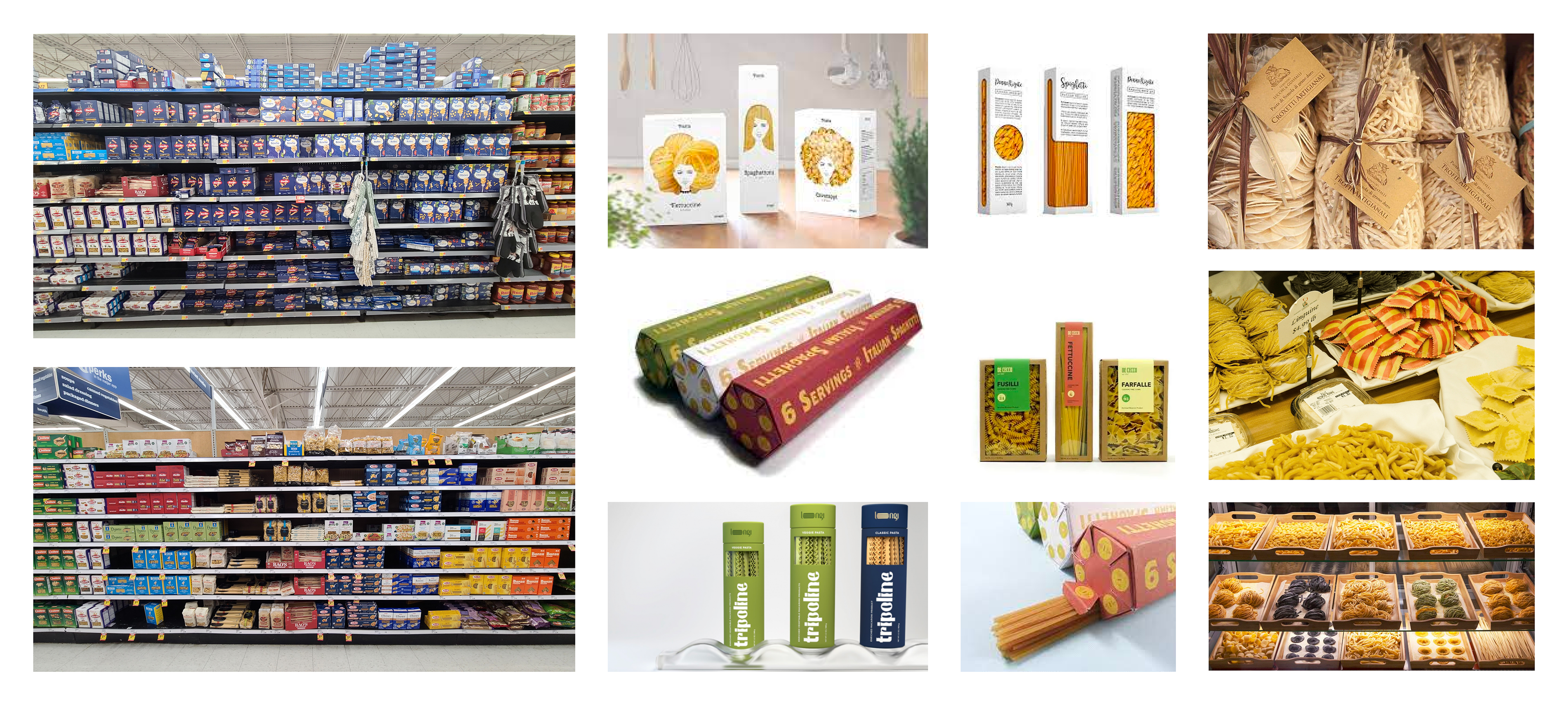
I was surprised to see the dominance of blue boxes in the pasta aisle of my local grocery stores. I also found the pasta aisles to be dominated by rectangular boxes. Some brands, like Raos, use bags to package their pasta, but I found their packages to look unorganized from shoppers picking through the packaging.
Online, I found more creative solutions to pasta packaging, specifically with the different shapes.
Make
Having a better understanding of existing solutions, it was time to turn my newfound knowledge into my own work.
With my initial sketches, I wanted to explore package solutions with large windows to give the idea of a minimal package, putting all the emphasis on the pasta.
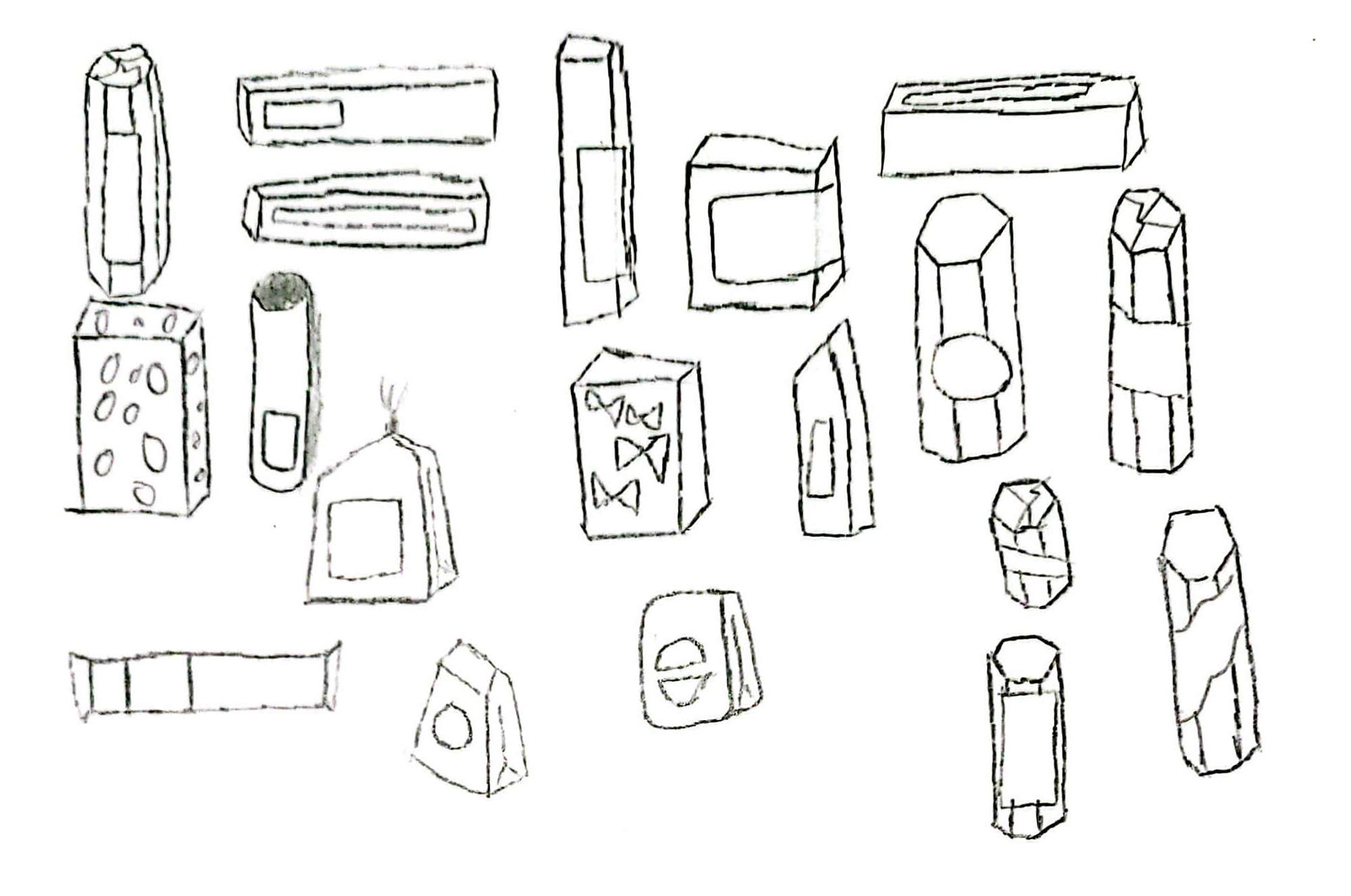
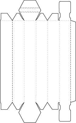
After looking at die lines, I came up with two solutions that I thought I could manipulate into something that would achieve my goal.
The die line on the left had an unusual shape, something I knew I wanted.
The right die line had an interesting top fold, something I thought would look pleasant on a shelf next to the industry standard flat top.

Make
After laying out a die with characteristics I like from both die lines, I began thinking about the actual designs I would want to use on my box.
My three main avenues included visuals of pasta, utilizing my three front facing panels to create the Italian flag, and illustrating the an Italian street where Al dente may be found and purchased.
Test
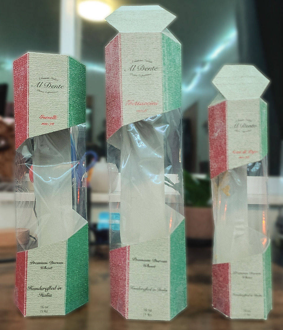
I decided to pursue the Italian flag concept, an homage to the Italian roots of Al Dente for my first designed prototype.
Insights
The artificial texture creates readability issues, especially with small type.
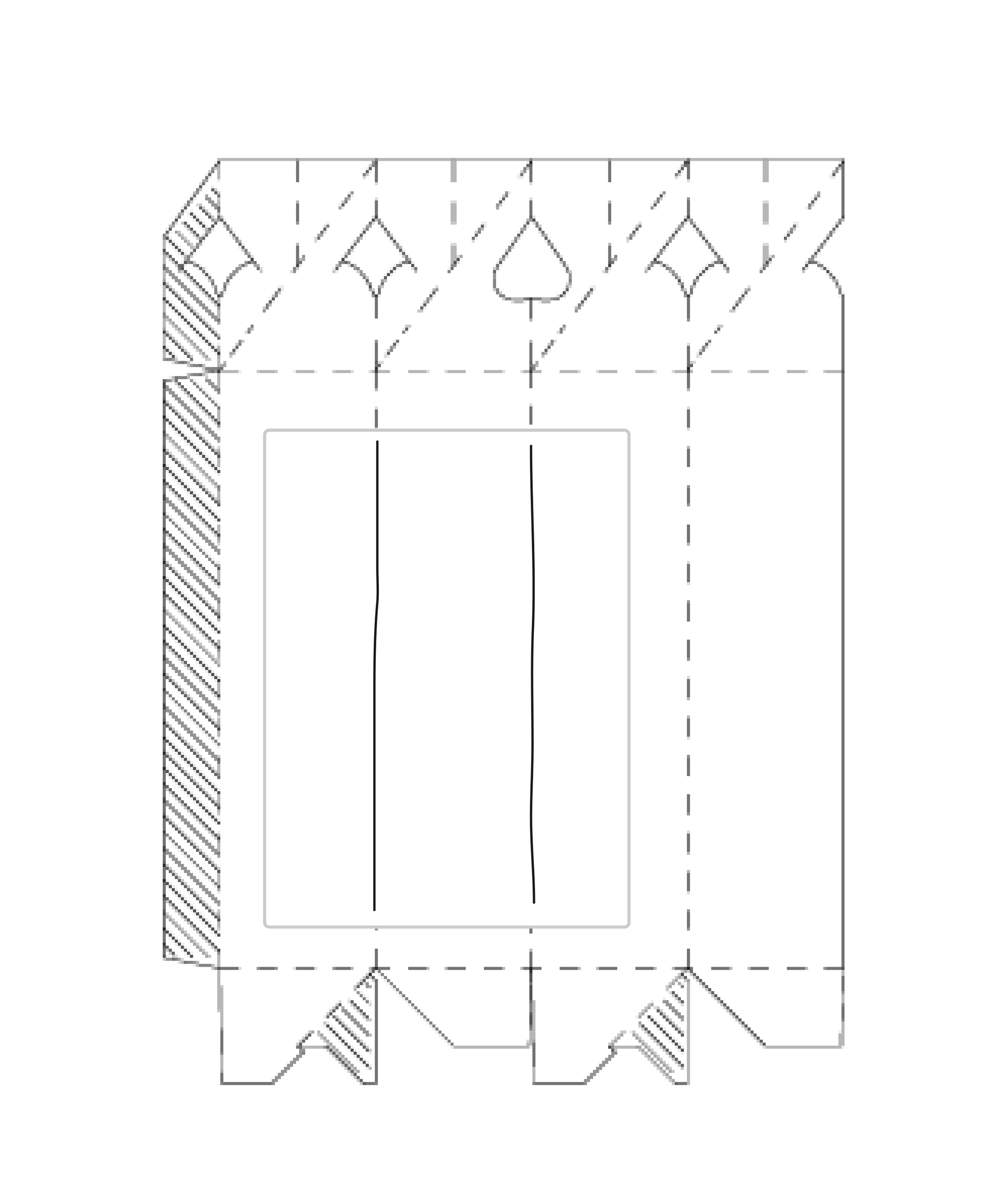
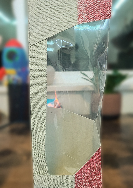
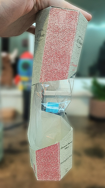
this new window creates an awkward interaction with the folding tab.
Because the window crosses five of six panels, the packages continued to lack structural stability.


Test
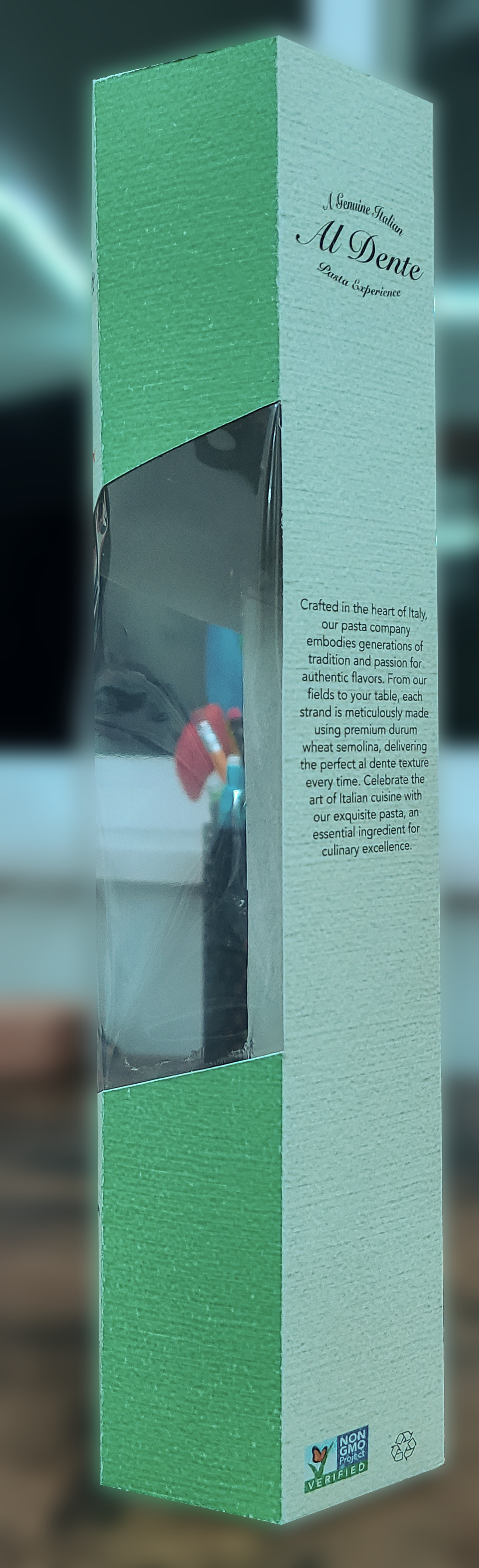
For this iteration, I weakened the artificial texture of the box to improve readability and created a smaller window, only spanning the front three columns instead of five.
Insights
Even with the weakened texture, some of the small type was still difficult to read due to the script typeface.
The top half of the front panel held two key informational pieces, but still felt empty.
The hexagonal shape of my packages allowed me to use the front three panels for shelf appeal, displaying an Italian countryside with the colors of the Italian countryside.
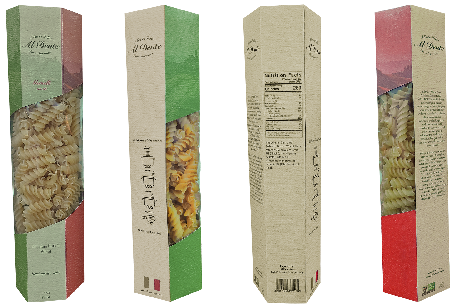
The rear three panels each have their own purpose: telling an overview of the Al Dente brand, nutrition facts, and cooking instructions.