Ferris State Registration
Research | User Experience | Prototyping
Each semester, every Ferris State University student goes through the same harrowing journey: registering for the next semester's classes. Currently, this process relies on a surplus of steps that require the student to use multiple tabs. The current registration is not mobile friendly, forcing students to be tied to a computer when registering.
The Current Process
I conducted a task analysis of the current registration process to identify opportunities for an improved experience. My findings showed that the process is broken primarily into two parts.
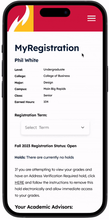
MyDegree

Insights
1. Lacks visual hierarchy of information.
2. Course registration numbers are tucked inside of course description pages.
3. Not responsive to mobile screens.
4. Cannot directly register for a course.
5. Cannot create a mock schedule.
2. Course registration numbers are tucked inside of course description pages.
3. Not responsive to mobile screens.
4. Cannot directly register for a course.
5. Cannot create a mock schedule.
MyFSU

Insights
1. Does not give a clear indication of errors prior to registration day.
2. Cannot view course descriptions.
3. Class registration numbers are not easily accessible.
2. Cannot view course descriptions.
3. Class registration numbers are not easily accessible.
Observations
In order to broaden my understanding on how students register for classes, I interviewed and conducted cognitive walkthroughs of four of my peers to get a more rounded understanding of the the registration process.

Opportunities
1. Place class registration numbers in more visible places.
2. Warn students of potential registration errors prior to registration day.
3. Create a mock schedule for students as they go through the scheduling process.
4. Only show courses that are available for students to register for.
2. Warn students of potential registration errors prior to registration day.
3. Create a mock schedule for students as they go through the scheduling process.
4. Only show courses that are available for students to register for.

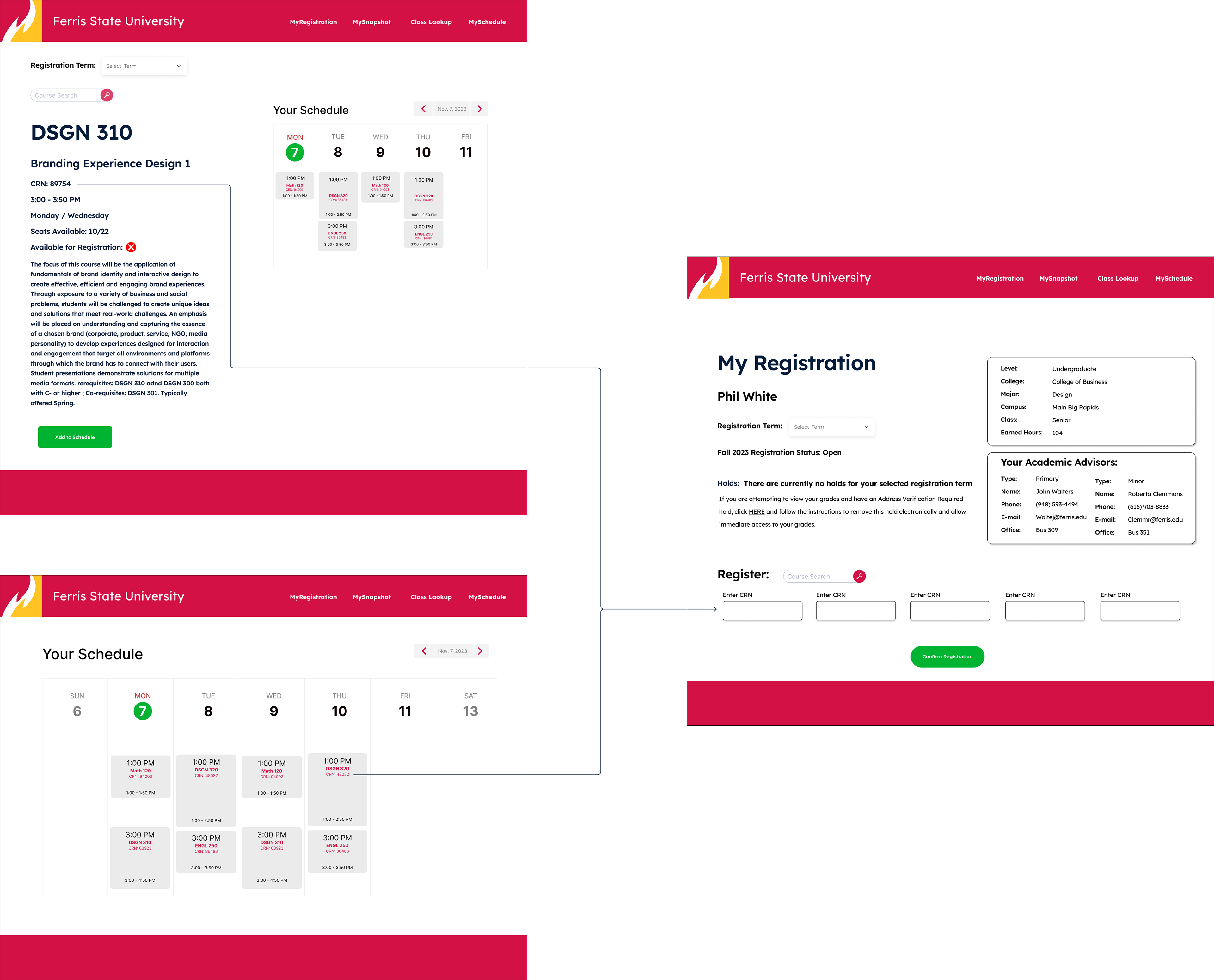
Class Registration Numbers
To eliminate extra confusion on registration day, class registration numbers are elevated on course description pages, as well as on mock schedules.

Registration Errors
Warning students of errors prior to registration day allows students ample time to find a different schedule that works for them.
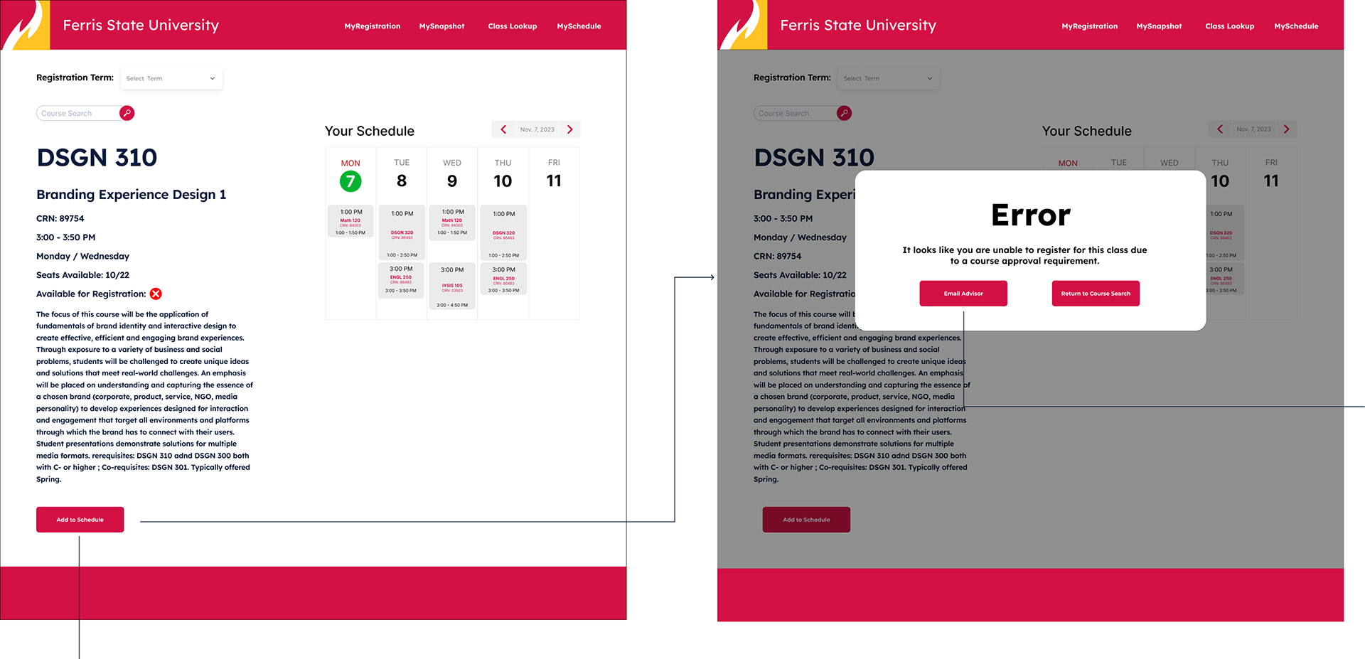
If students have a conversation with a faculty member and believe they should be able to register for a course, they are able to reach out directly their advisor to resolve the error.
Because there is an error in the student’s schedule, the button is filled red instead of green.

Mock Schedules
Creating a mock schedule will reduce the possibility of an error and give students reassurance that they are signing up for the right courses.


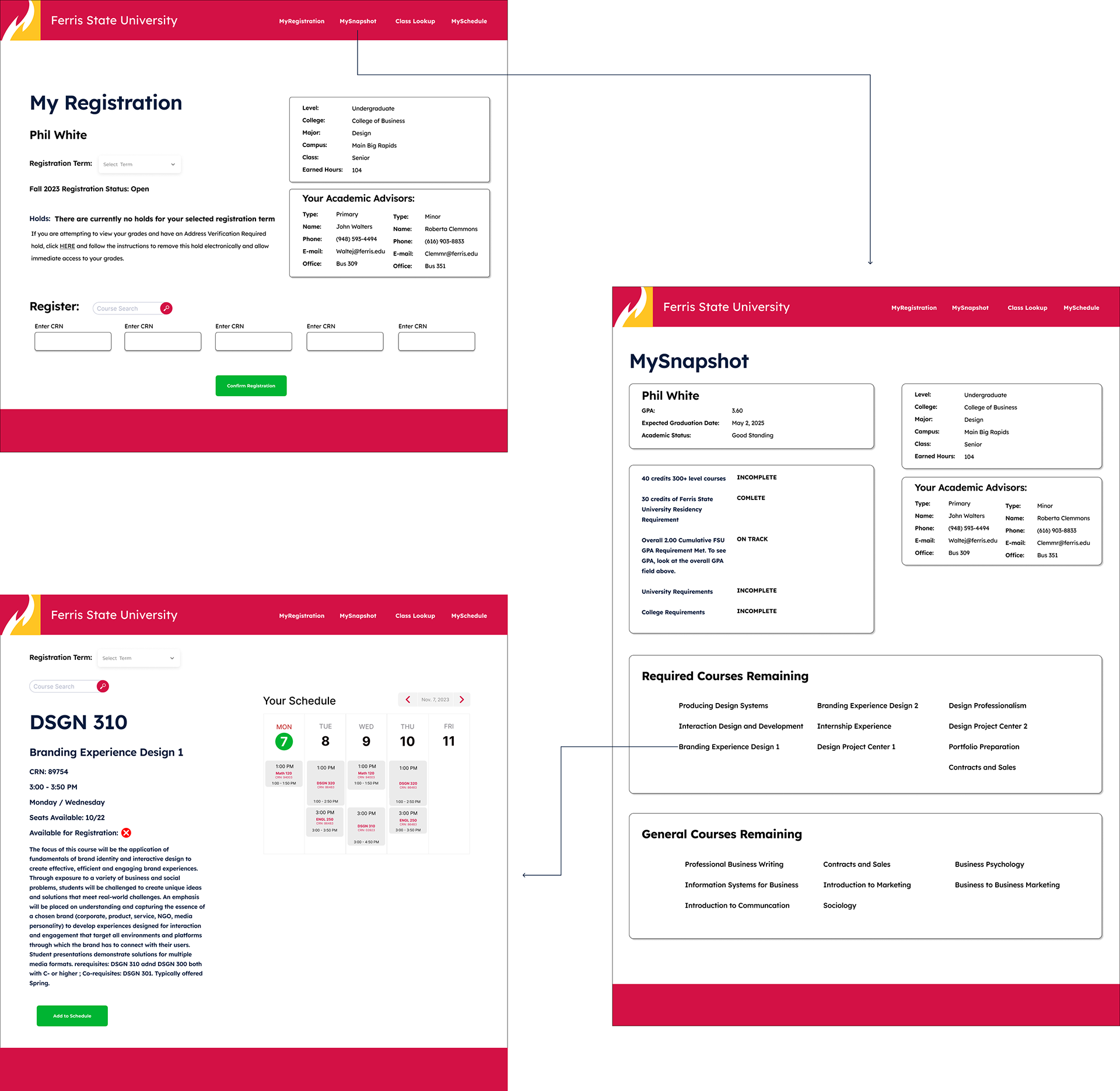
Available Courses
Highlighting relevant courses on the student’s snapshot page ensures they know exactly what courses they need to register for prior to graduation to keep them on track.
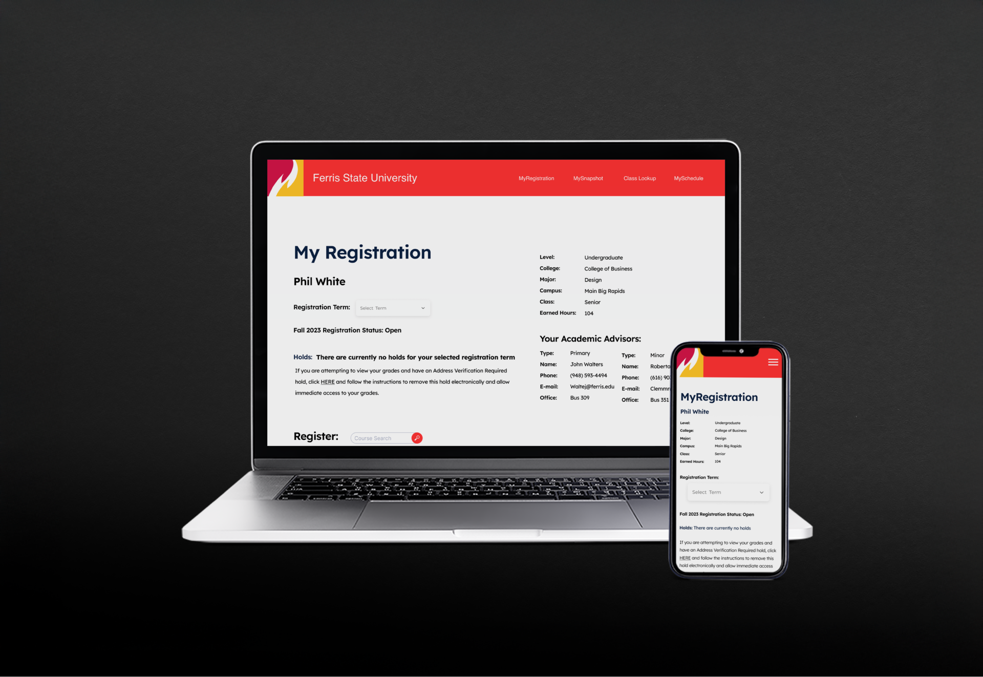
Recognizing that students are not always at a computer when their class registration time comes, this new experience is also responsive for mobile devices.
Advisor View
University faculty also interact with MyDegree. Their primary goals are to access student dashboards, review their classes, and approve them for registration.